Note - Hit up Lexi if you’re hiring, she’s on the lookout for any journalism opportunities!
Analysis
Load Packages
library(tidyverse)
── Attaching core tidyverse packages ──────────────────────── tidyverse 2.0.0 ──
✔ dplyr     1.1.4     ✔ readr     2.1.5
✔ forcats   1.0.0     ✔ stringr   1.5.1
✔ ggplot2   3.5.1     ✔ tibble    3.2.1
✔ lubridate 1.9.4     ✔ tidyr     1.3.1
✔ purrr     1.0.2
── Conflicts ────────────────────────────────────────── tidyverse_conflicts() ──
✖ dplyr::filter() masks stats::filter()
✖ dplyr::lag()    masks stats::lag()
ℹ Use the conflicted package (<http://conflicted.r-lib.org/>) to force all conflicts to become errors
library(dplyr)library(ggplot2)library(plotly)
Attaching package: 'plotly'

The following object is masked from 'package:ggplot2':

    last_plot

The following object is masked from 'package:stats':

    filter

The following object is masked from 'package:graphics':

    layout
library(ggthemes)library(scales)
Attaching package: 'scales'

The following object is masked from 'package:purrr':

    discard

The following object is masked from 'package:readr':

    col_factor
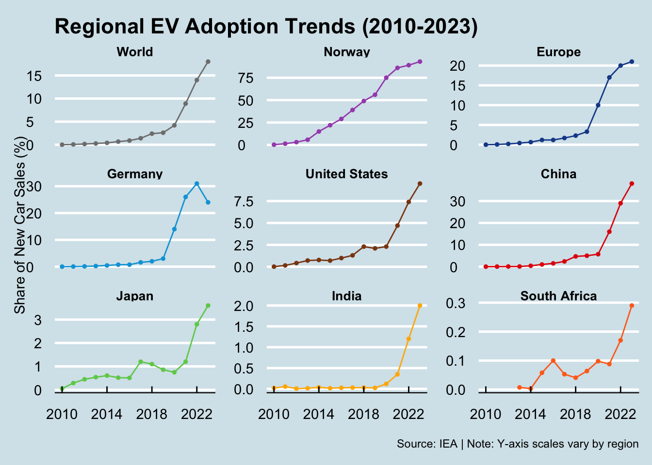
# List of 9 major countries and regionscountry_list <-c("World", "Norway", "Europe", "Germany", "United States", "China", "Japan", "India", "South Africa")
ev_share_trend <- ev_share_clean |>filter(year >=2010, year <=2023, region %in% country_list) |>group_by(region, year) |>arrange(desc(share))